What a founder should see on their dashboard in 5 seconds
A dashboard home has one job: tell you what needs your attention, fast. Here's the 5-second check I use when I design or review one.
 Moin HaiderUI/UX designer for SaaS & fintech dashboards
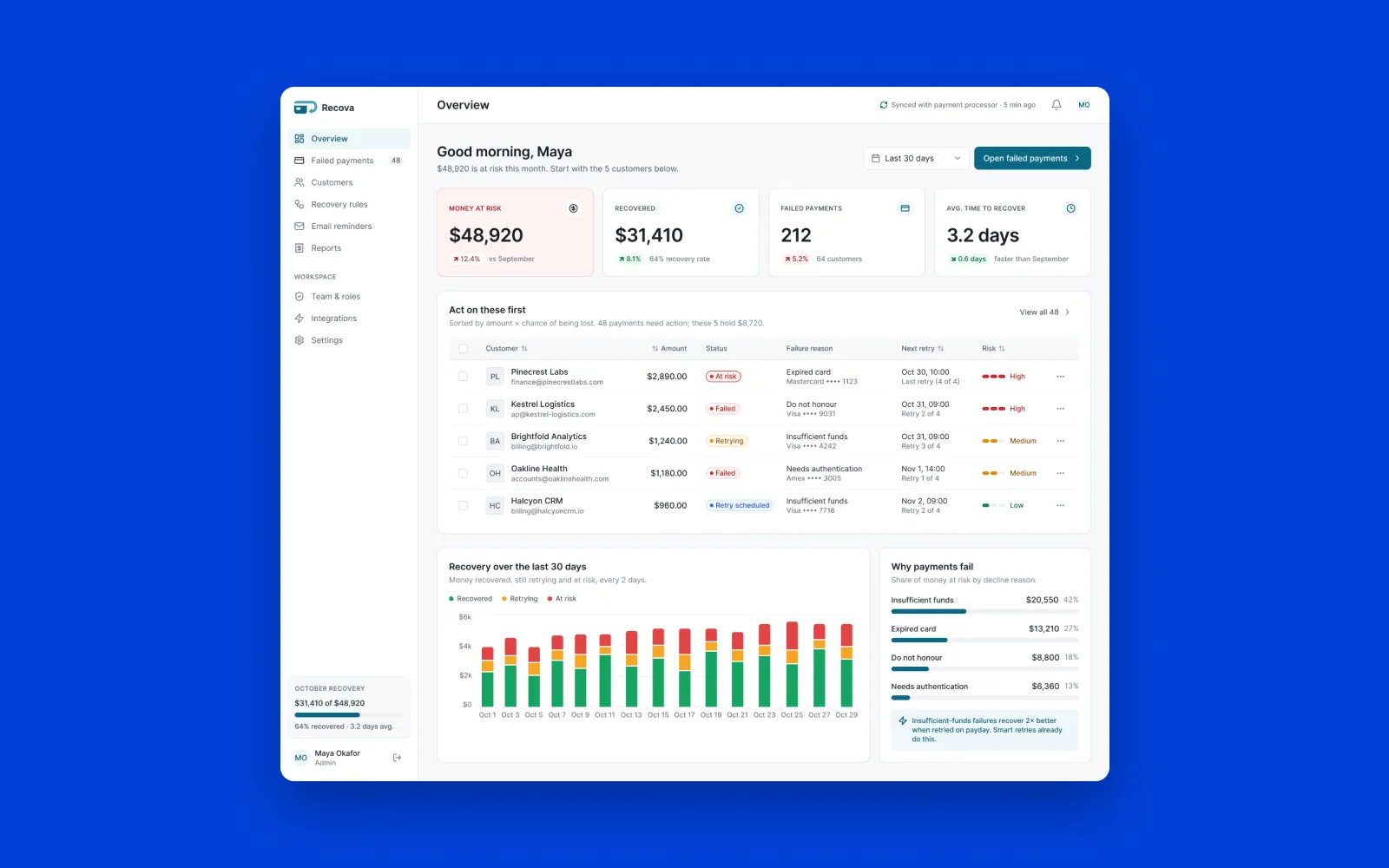
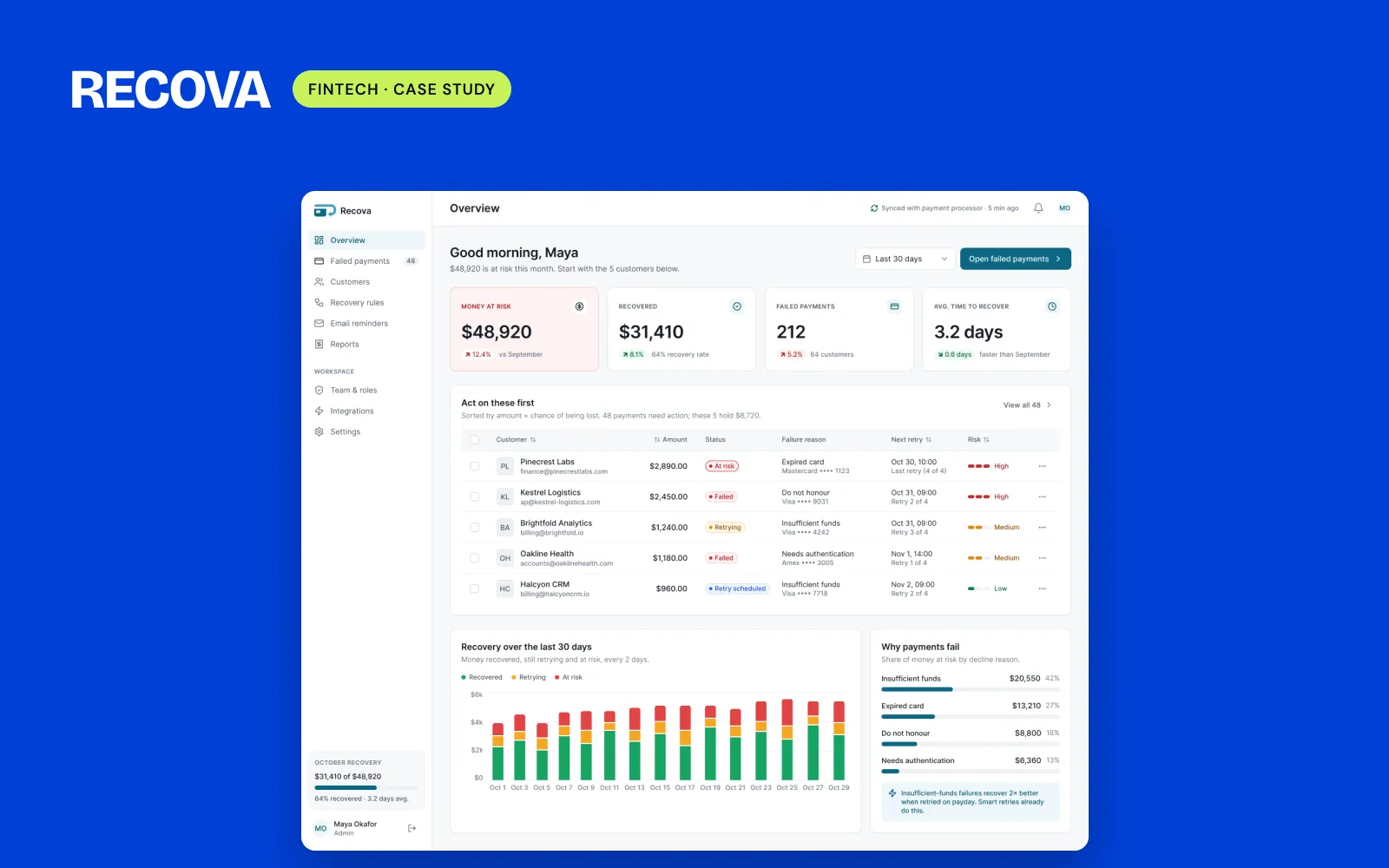
When I start a dashboard, I write its 5-second goal before anything else. For Recova, a failed payments dashboard I designed as a concept, it was: in 5 seconds, the user sees the money at risk and the customers to act on first. I checked every screen against that one sentence.
How to run the check
- Write down the one thing your user needs to know when they open the dashboard.
- Show the screen to someone for 5 seconds, then hide it.
- Ask what they saw and what they would do next.
If their answer matches your sentence, the home screen is doing its job. If they mention a chart title, a menu item or nothing at all, it isn't. It doesn't replace proper user testing, but it takes a few minutes and the answer is hard to argue with.
What I look for when it fails
In the audits I've done, the home screens that would fail it had one of these problems:
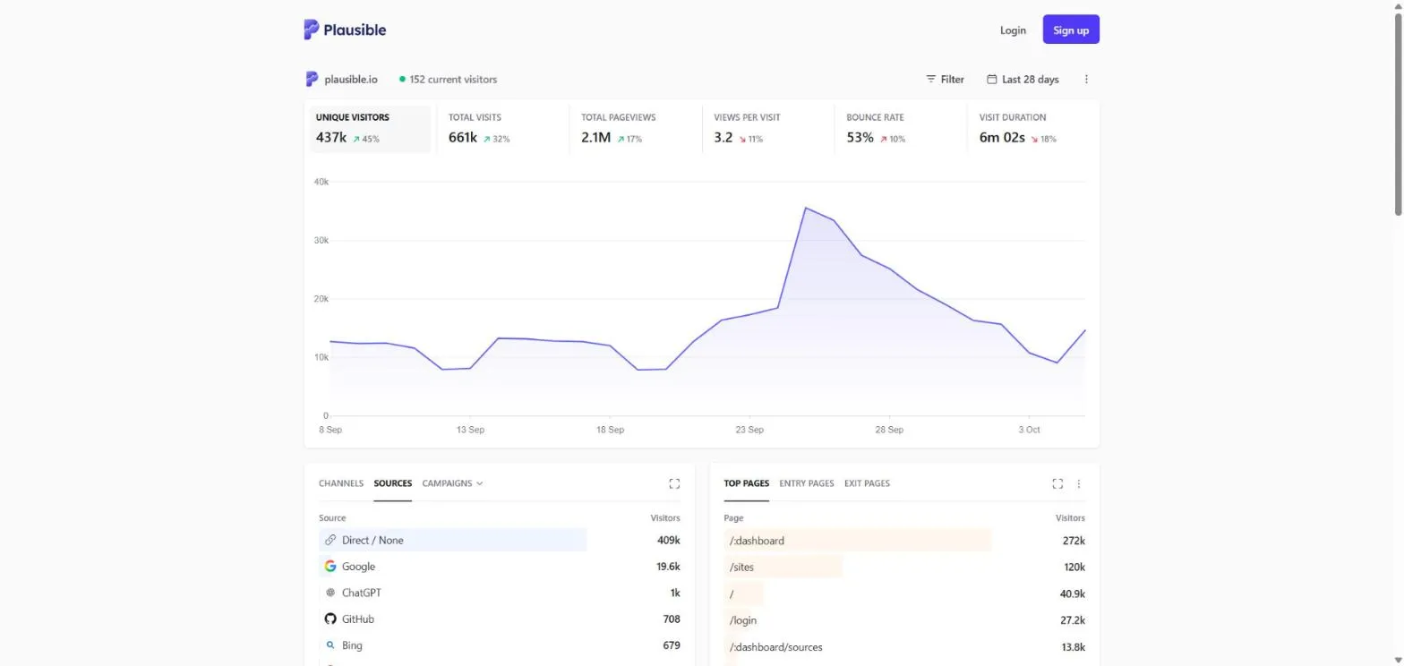
- Everything has the same weight. Plausible shows six KPIs in identical cards, so nothing says "look here first".
- The important list sits under a chart. RoboPandit's admin home opened with a revenue chart, and the things to act on were further down.
- Numbers have no context, like a % change with no period next to it.
One big number, then one list
Recova's Overview opens with one critical figure, $48,920 at risk this month, in the only red card on the page. Right below it is "Act on these first": five customers ranked by amount and risk. The trend chart and the failure reasons are quieter and further down.
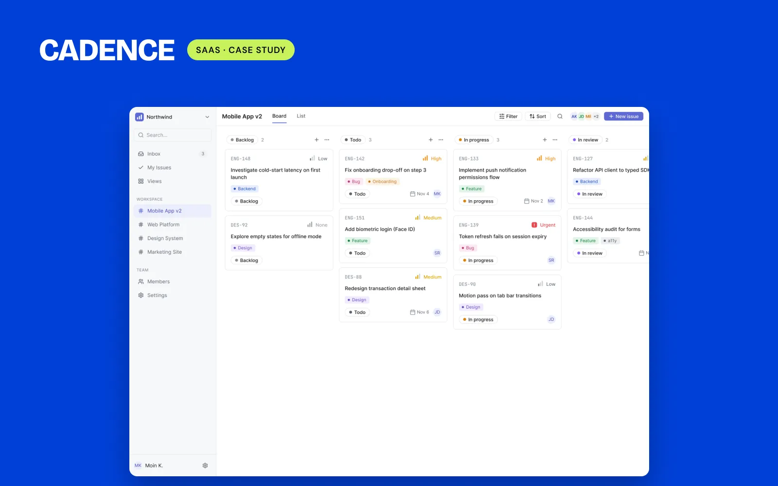
Cadence, a project tool I designed, starts from a different user with the same idea. A team member's first question is "What should I work on today?", so that question shaped the dashboard.
I haven't run this check on Recova with real users yet. It's the first test I'd run.