01
One big number, then one list
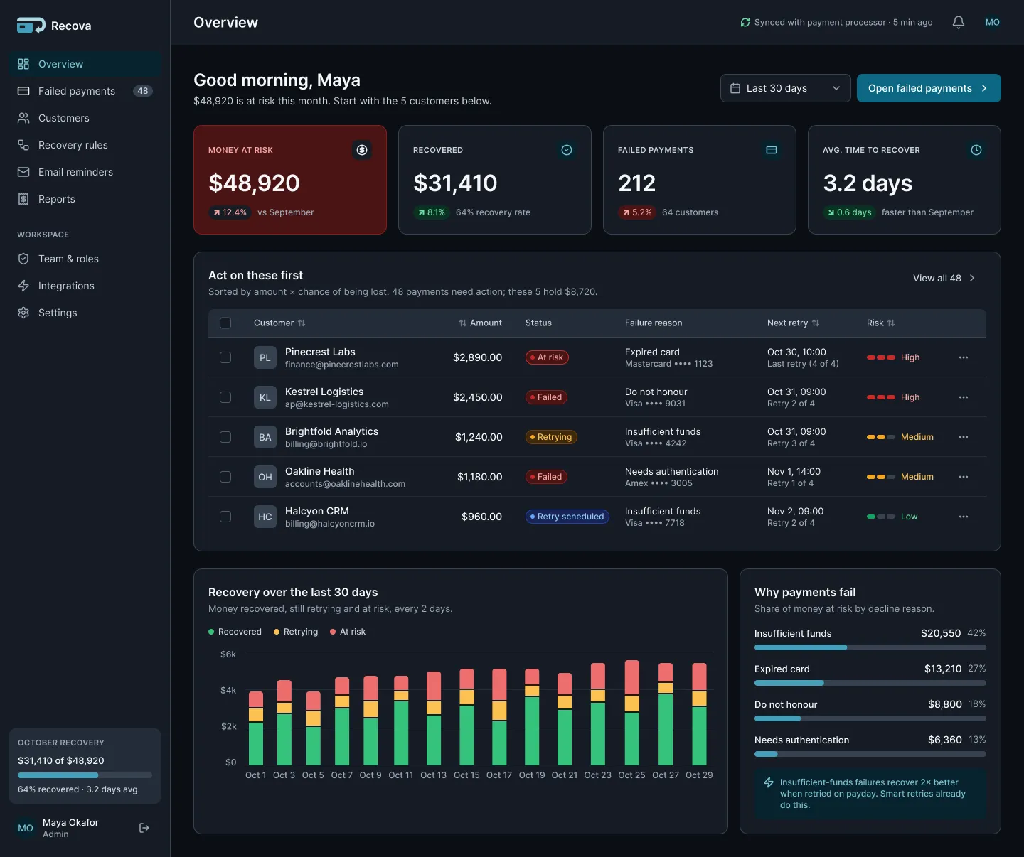
The Overview opens with one critical figure, $48,920 at risk this month. Right below it, "Act on these first" ranks five customers by amount and risk. Everything else is quieter.
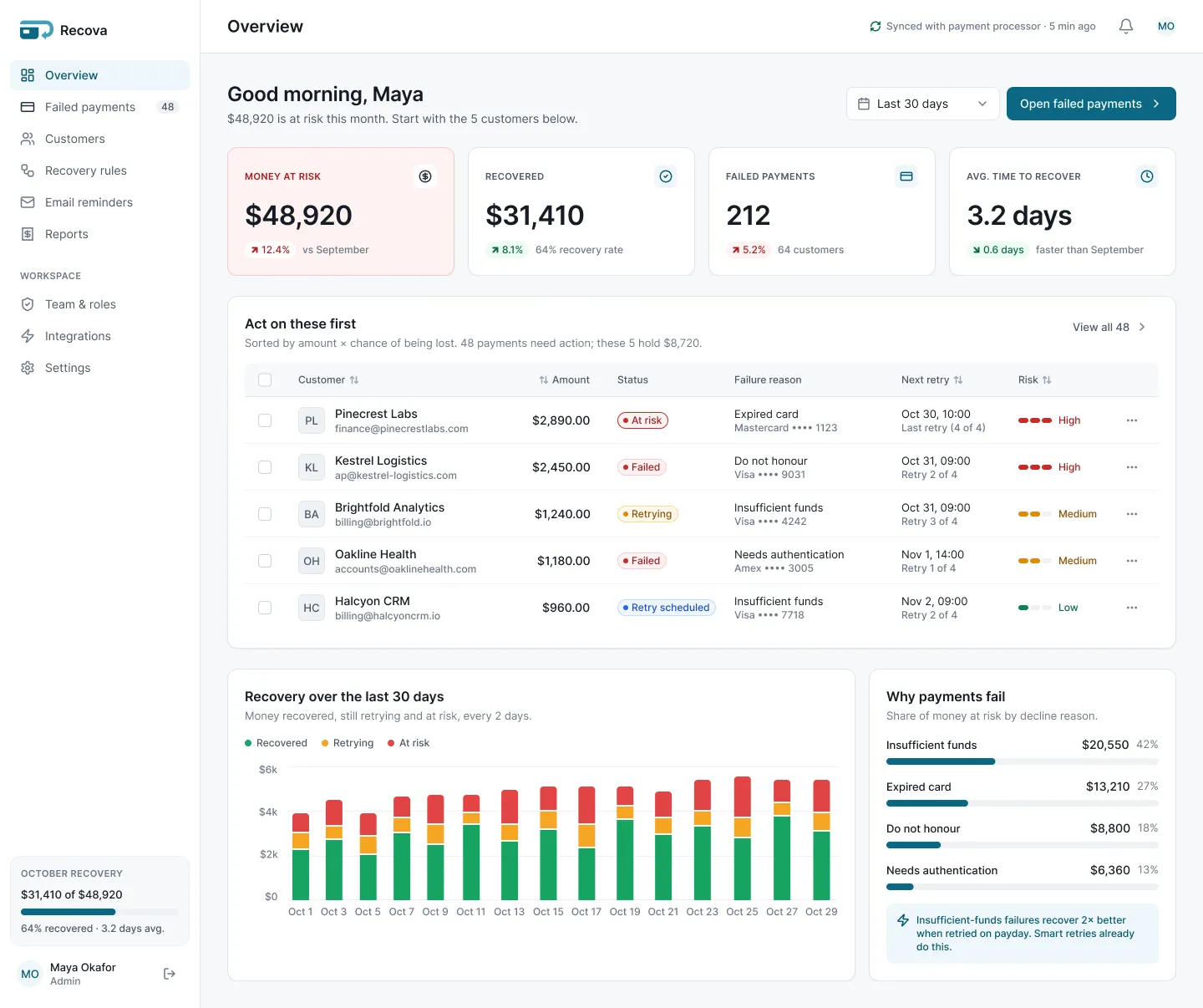
A dashboard that shows a SaaS team how much money is at risk from failed card payments, and which customers to act on first.
/The problem
When a customer's card fails, the money does not disappear. It sits in a long list of errors that nobody has time to read. Founders know revenue is slipping, but not where to start.
/My approach
The goal was simple to say and hard to design: in 5 seconds, the user sees the money at risk and the customers to act on first. Every screen was checked against that one test.
I built the design system first, then every screen from it: 161 variables with Light and Dark modes, 15 text styles, 49 icons and about 45 components. The 10 screens use only system parts, plus a Dark version of the Overview.
Recova is a self-initiated concept with fake companies and data. I designed it and built it with AI help under my direction, and it hasn't been tested with real users yet.
/Who uses it
Founder
“How much money is at risk, and where do I start?”
Finance viewer
“Can I see the whole picture without changing anything?”
/Key decisions
The Overview opens with one critical figure, $48,920 at risk this month. Right below it, "Act on these first" ranks five customers by amount and risk. Everything else is quieter.
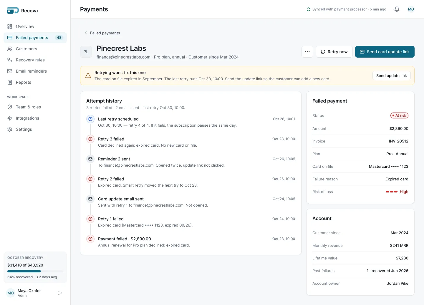
Will a retry even work? For an expired card it won't. So the customer page says "Retrying won't fix this one" and makes "Send card update link" the main button.
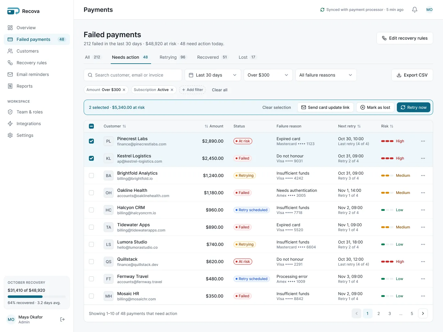
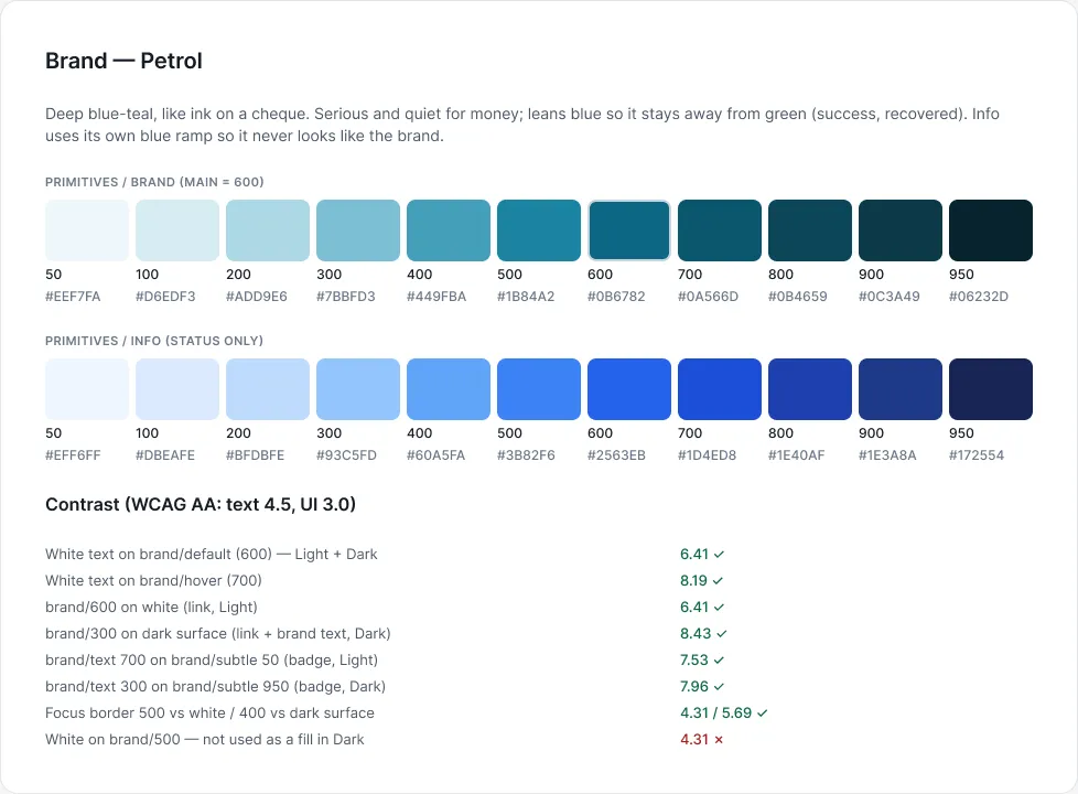
Red is at risk, amber is retrying, green is recovered, grey is lost. The brand colour, a calm petrol blue-teal, stays away from all of them, so a button is never mistaken for a status.
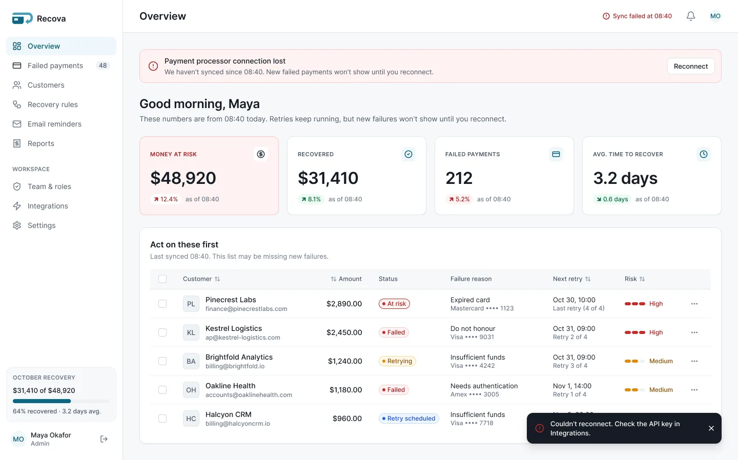
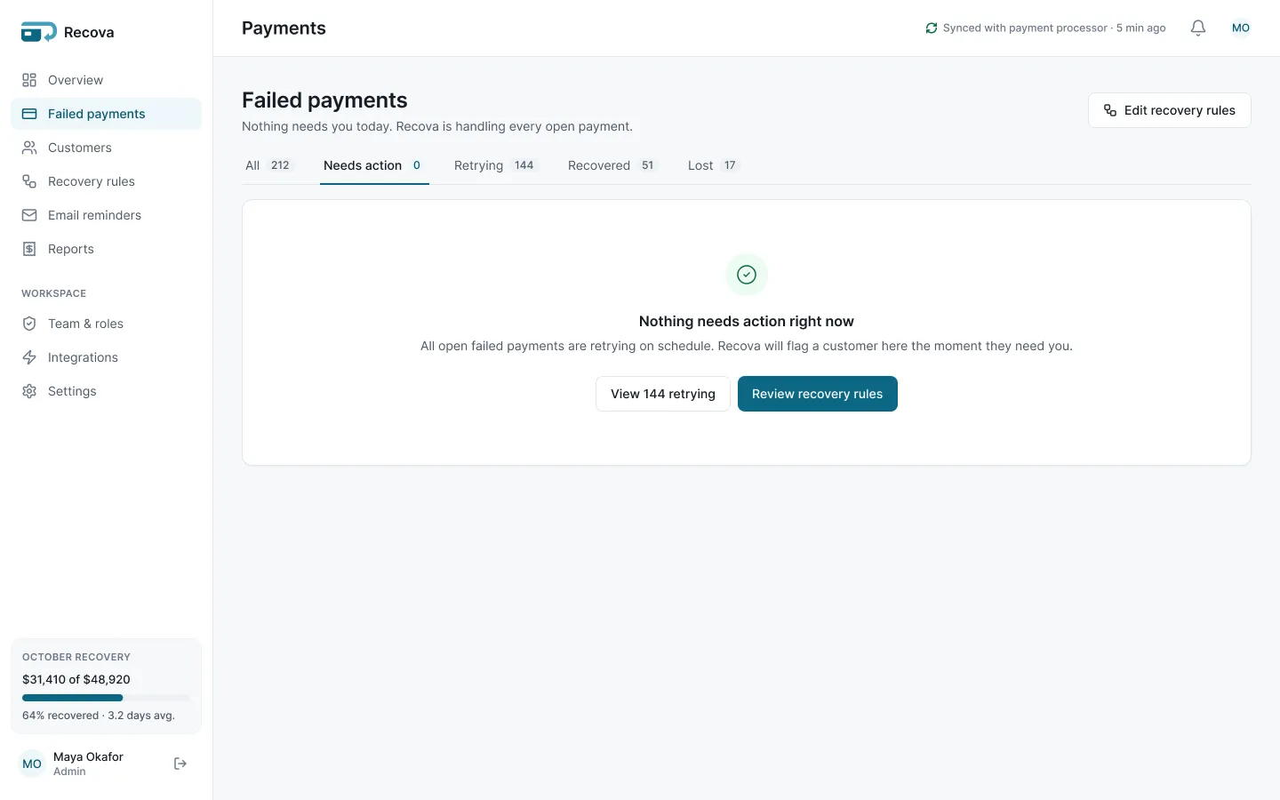
When the payment processor disconnects, the screen says the numbers are from 08:40, not today. When nothing needs action, the queue says so and offers the next useful step.
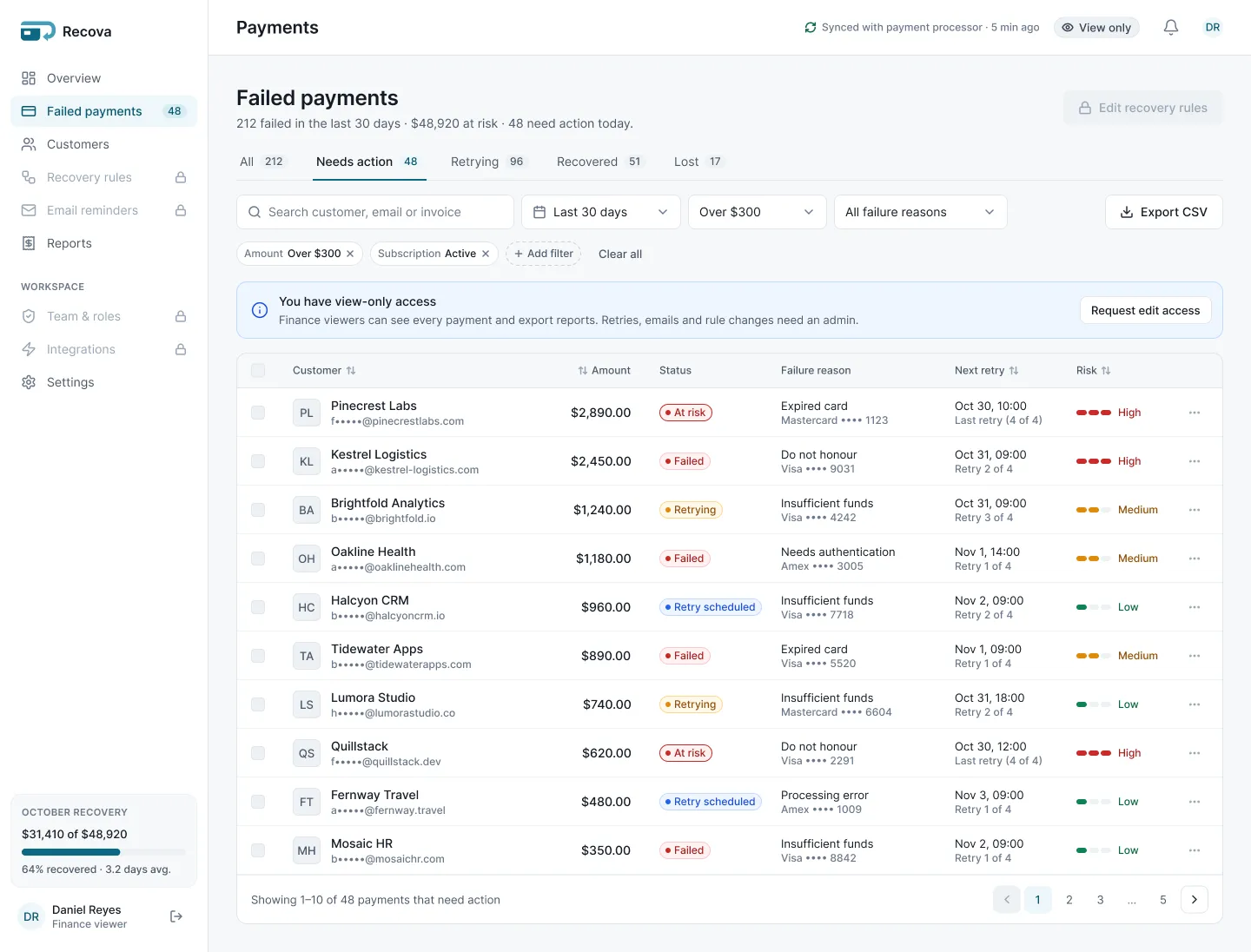
A finance viewer sees the same pages, read-only: disabled actions, masked emails, and a lock icon where they can't edit. Nothing is hidden, so the team still shares one picture.
/Screens
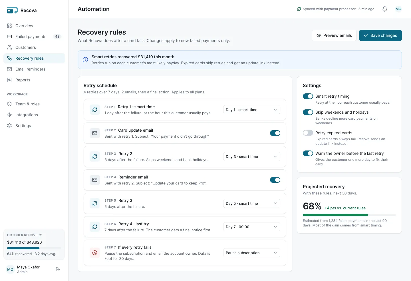
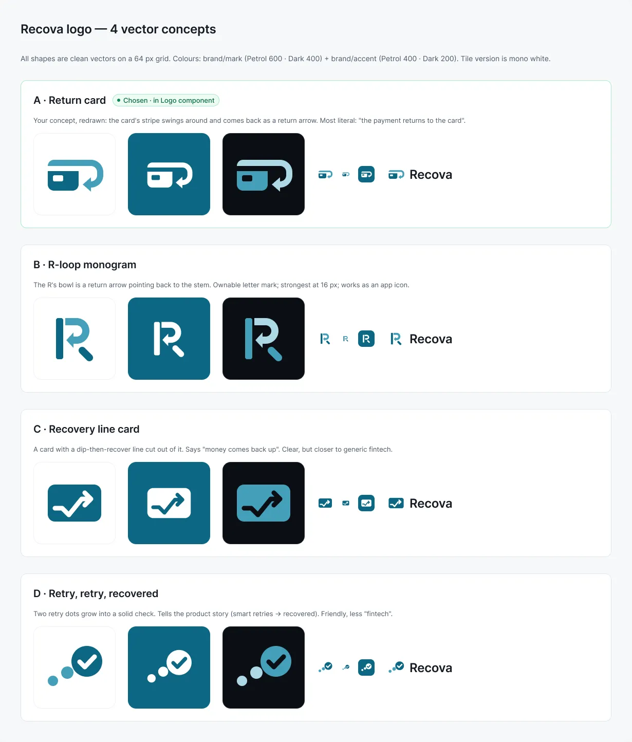
The Overview in Dark, the recovery rules, the empty state and the logo exploration. 10 screens in all, made only from system parts.
/Design system
161 variables with Light and Dark modes, 15 text styles, 5 elevation styles, 49 icons and about 45 components. Contrast checked against WCAG AA.
/What I'd do next
Recova hasn't been tested with real users, so I make no claims about results. First I'd test one question: does a new user find the riskiest customer in 5 seconds? Before shipping, I'd also fix the Dark mode button hover, which is only a little darker than the default.
Need a dashboard like this? See Fintech Dashboard Design
Tell me what you're building. I'll tell you honestly if I'm the right fit.
Your time: —My time (Pakistan): —I reply within 24 hours on weekdays.