01
Numbers you can read on black
Every number a user must read passes accessible contrast on black. Essential text never sits in a low grey, so prices and balances stay sharp at a glance.
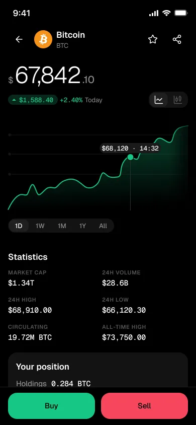
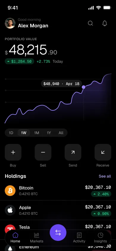
A dark-mode crypto and stocks investing app for iOS and Android, built to prove a numbers-heavy interface can stay calm and easy to read.
/The problem
Dark mode is easy to make look good. It's hard to make readable. Finance apps live in numbers: balances, live prices, gains and losses. On a black background, one weak grey or one careless colour and the whole screen turns to mud.
/My approach
The answer was to build the system before the screens. I set three rules first: every number a user must read passes accessible contrast on black, one violet accent is used only for actions, and green and red only ever mean gains and losses.
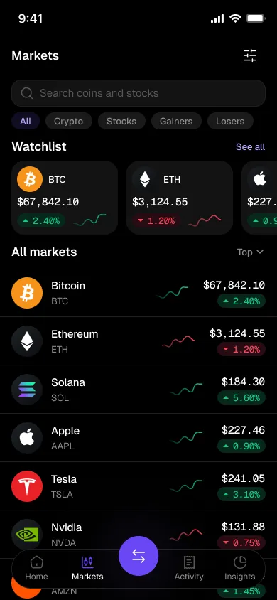
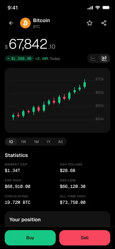
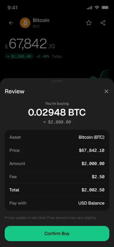
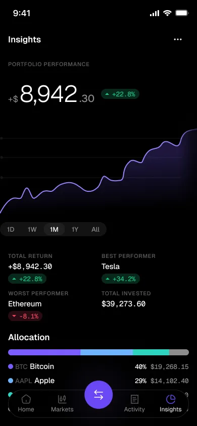
Then I mapped the three journeys that matter most: getting started (splash, onboarding, sign in), buying an asset (markets, asset detail, amount, review, success) and tracking performance (insights, allocation and top movers).
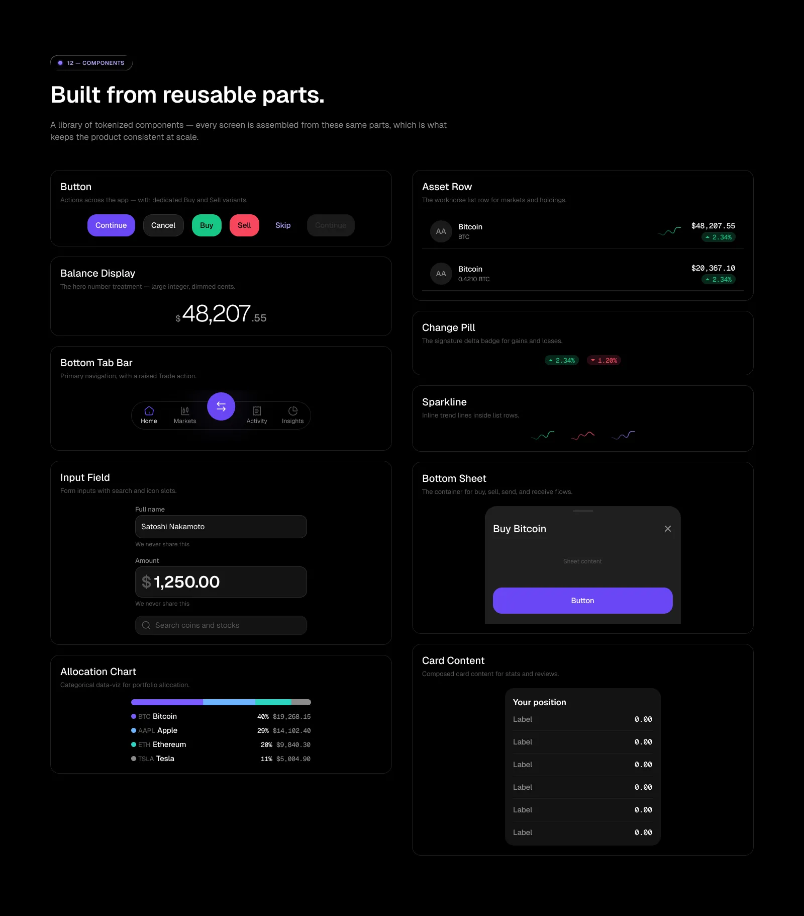
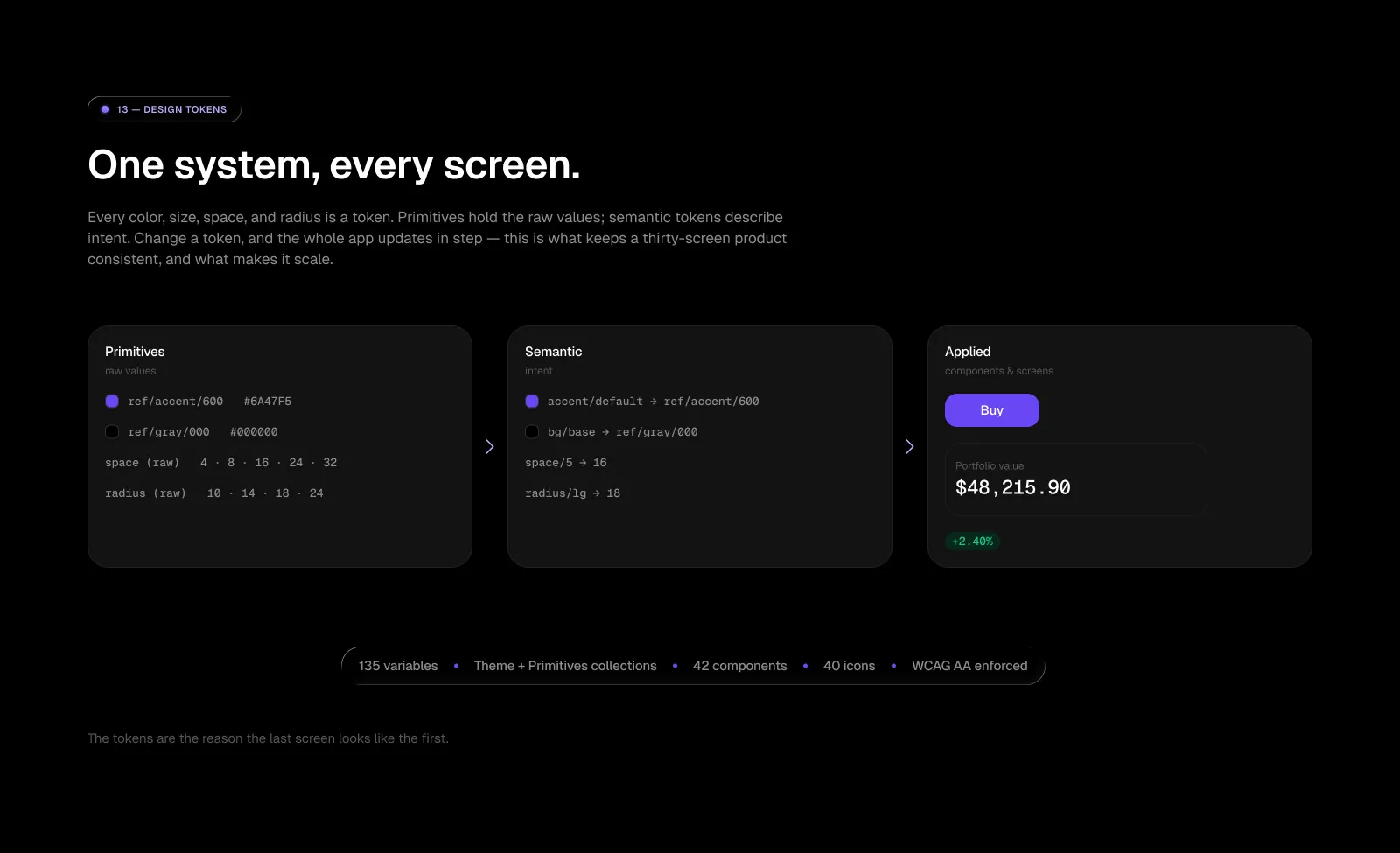
The 135 tokens and 42 components came next, and the 36 screens were assembled from them. That's why the hundredth list row looks exactly like the first.
/Who uses it
The active trader
“What's the price right now, and can I trade fast?”
The long-term investor
“How is my portfolio doing over time?”
/Key decisions
Every number a user must read passes accessible contrast on black. Essential text never sits in a low grey, so prices and balances stay sharp at a glance.
One violet for the brand and every primary action. Green and red are kept only for gains and losses, so a price move is never mistaken for a button.
Primitives hold raw values, semantic tokens describe intent, and 42 components build every screen. The hundredth list row is built exactly like the first.
/Screens
Markets, candlestick chart, buy review and insights. 36 screens on one design system.
/Design system
135 tokens, 15 text styles in Geist and Geist Mono, 42 components and 40 icons. WCAG AA contrast enforced.
/What I'd do next
Meridian is a concept, so it hasn't met real investors yet. Next I'd test the buy flow with a few active traders, check the numbers stay readable on a bright screen outdoors, and add a light theme built from the same tokens.
Building a fintech product? See Fintech Dashboard Design
Tell me what you're building. I'll tell you honestly if I'm the right fit.
Your time: —My time (Pakistan): —I reply within 24 hours on weekdays.