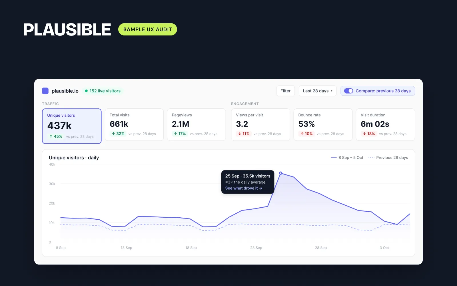
I audited Plausible's dashboard: 10 things I'd fix
A clean, fast analytics dashboard with one big gap: numbers without context. Here's what I'd change first, and why.
 Moin HaiderUI/UX designer for SaaS & fintech dashboards
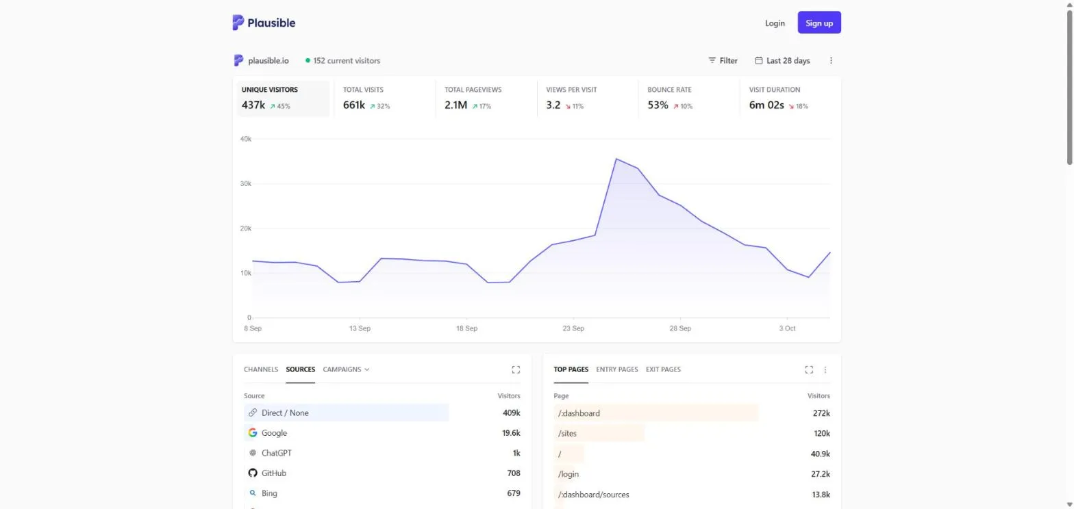
Plausible is one of the cleanest analytics dashboards around. It loads fast, it's private by design, and its KPIs are coloured by meaning, not direction: bounce rate going up is red, visitors going up is green. Plenty of dashboards get that wrong.
So I gave it the same review I give paying clients: what does a busy founder need from this screen, and where does the design get in the way? This is a self-initiated sample. I'm not affiliated with Plausible.
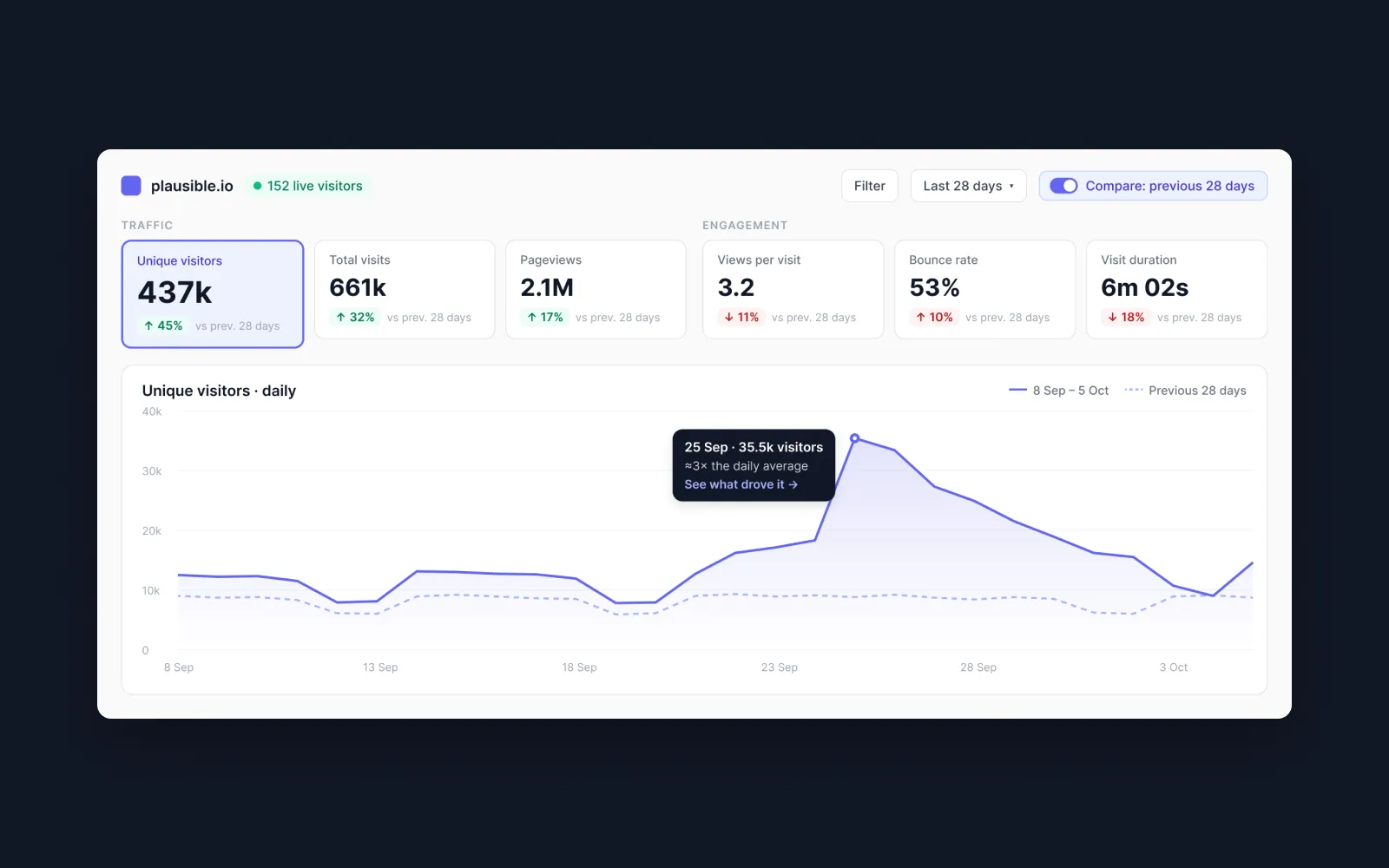
1. Every % change needs a reference
"↗ 45%" never says compared to what. Hovering shows the exact number, but not the period. Is it last month, last year, the previous 28 days? The fix is small: add "vs previous 28 days" under each KPI, or one caption under the row.
2. The chart needs a title
The KPI you select drives the chart, but the selected state is a faint grey box. New users don't realise the KPIs are tabs, or which metric the line shows. A title like "Unique visitors · daily" and a stronger selected state fix both.
3. Compare is hidden
Comparing periods is one of the most useful views in analytics, and it sits at the bottom of the date menu. I'd move it to a toggle next to the date picker and draw the previous period as a dashed line.
Same data. A clearer story.
The other 7, quickly
- The 25 Sep spike (about 3× normal) has no context. Annotate the biggest change with its top source.
- All six KPIs have equal weight. Group traffic and engagement, and make the selected one bigger.
- On mobile, the KPIs and chart fill the whole first screen. Use scrollable KPI chips and a shorter chart.
- The live visitor count loses its label on mobile. Keep a short label like "125 live".
- Mixed capitalisation: "Last 28 days" next to "Last 28 Days". Use sentence case everywhere.
- A tooltip covers a menu item in the filter menu. Move it beside the menu.
- Developer notation in page paths ("/:dashboard"). Show a readable label instead.
What I'd ship first
Issues 1, 2, 7, 8, 9 and 10 are quick wins: copy and small UI changes a team can ship in a week. Compare and the KPI hierarchy are bigger, so they go in the next sprint.