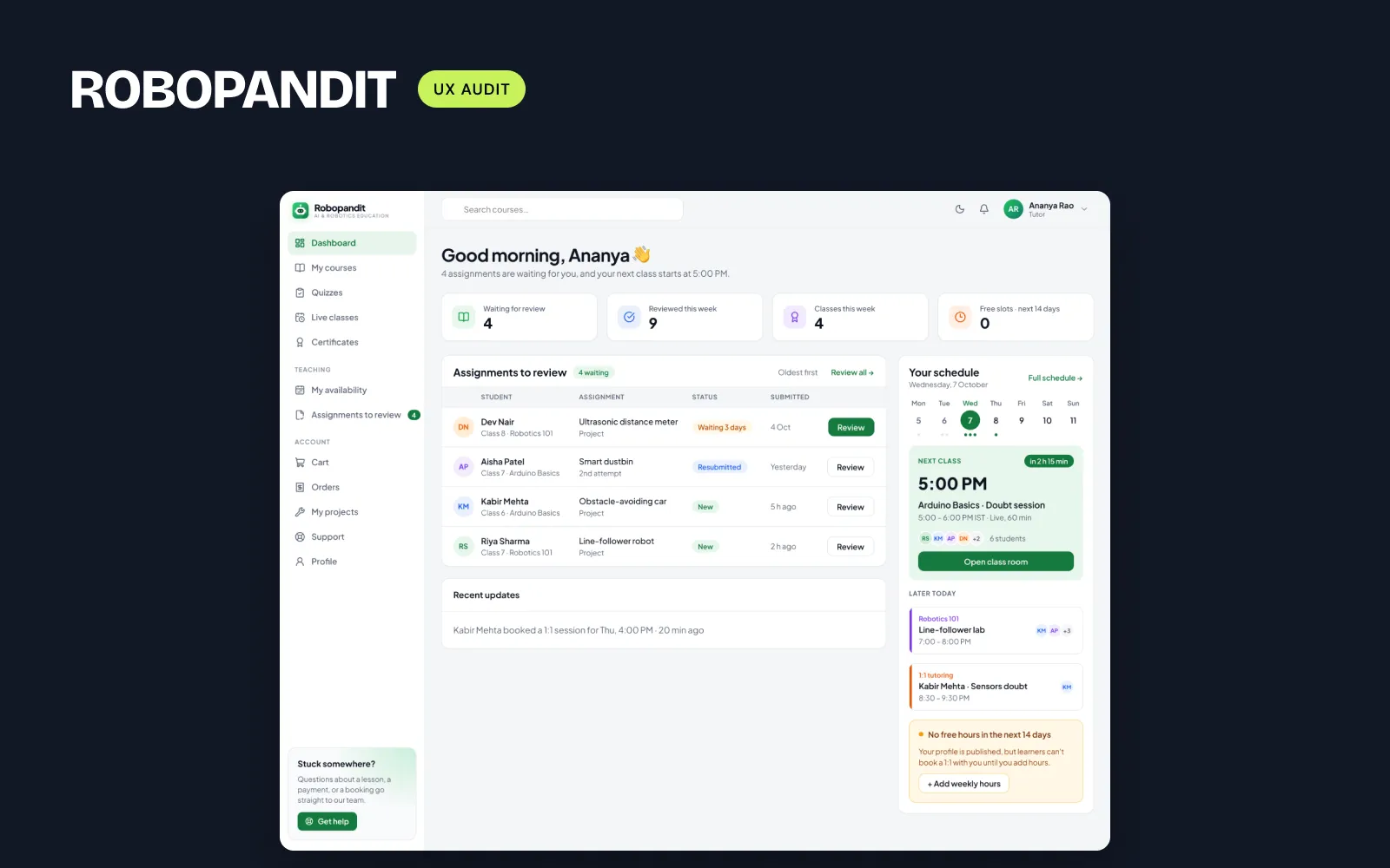
One home per role: what RoboPandit taught me about multi-role dashboards
When every role lands on the same home page, the work people came to do is always one or two clicks away. Here's what I changed in my RoboPandit audit.
 Moin HaiderUI/UX designer for SaaS & fintech dashboards
RoboPandit is an AI and robotics learning platform with three kinds of users: learners, tutors and admins. The founder gave me permission to review the public demo and share the results, so I logged in as a tutor and as an admin and went through their main tasks.
The platform is well built and the admin console is strong. But one pattern kept coming back: tutors and admins both started on the learner's home. A tutor who came to check assignments had to leave the home page to find them, and an admin had to go looking for their console.
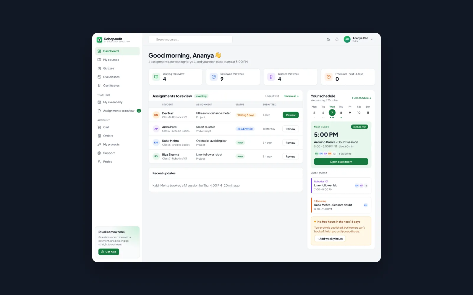
What a tutor's home needs to answer
I asked what a tutor wants to know the moment they log in. It came down to three questions: what's waiting for me to review, when is my next class, and is my availability set? The redesigned tutor home answers those three, in that order.
Admins need the problems first
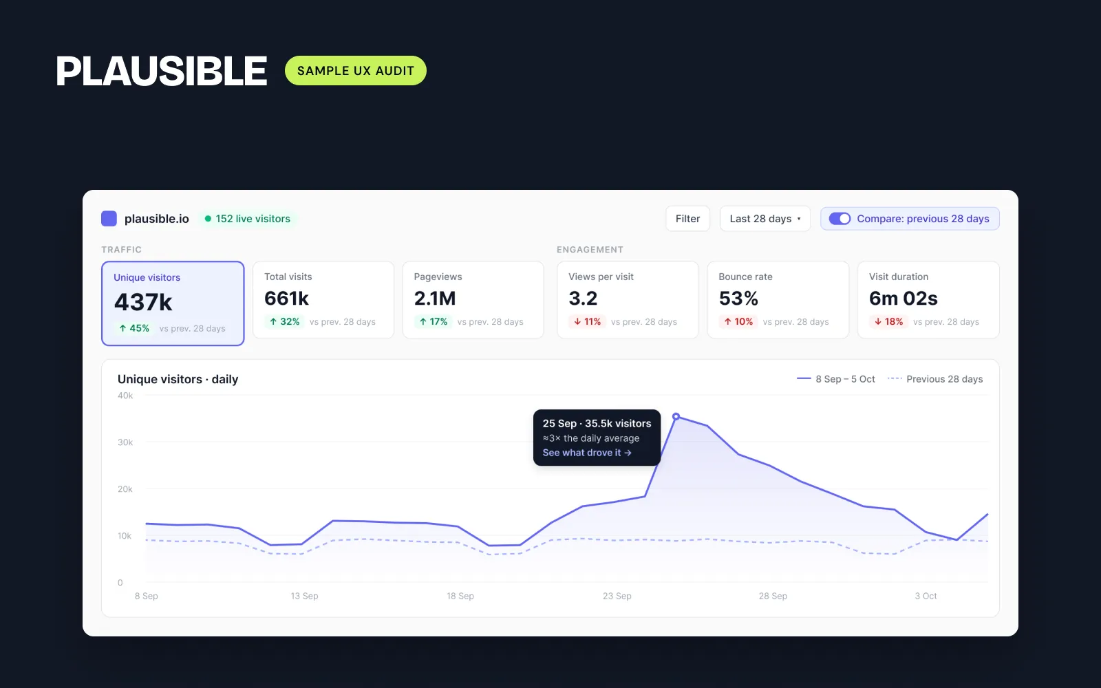
The admin dashboard opened with a revenue chart that sat flat at ₹0 in the demo, and the list of things to act on was further down. In the redesign, "Needs attention" moves up under the KPIs, and developer setup alerts move to their own System page, so they stop mixing with day-to-day work.
Don't forget day one
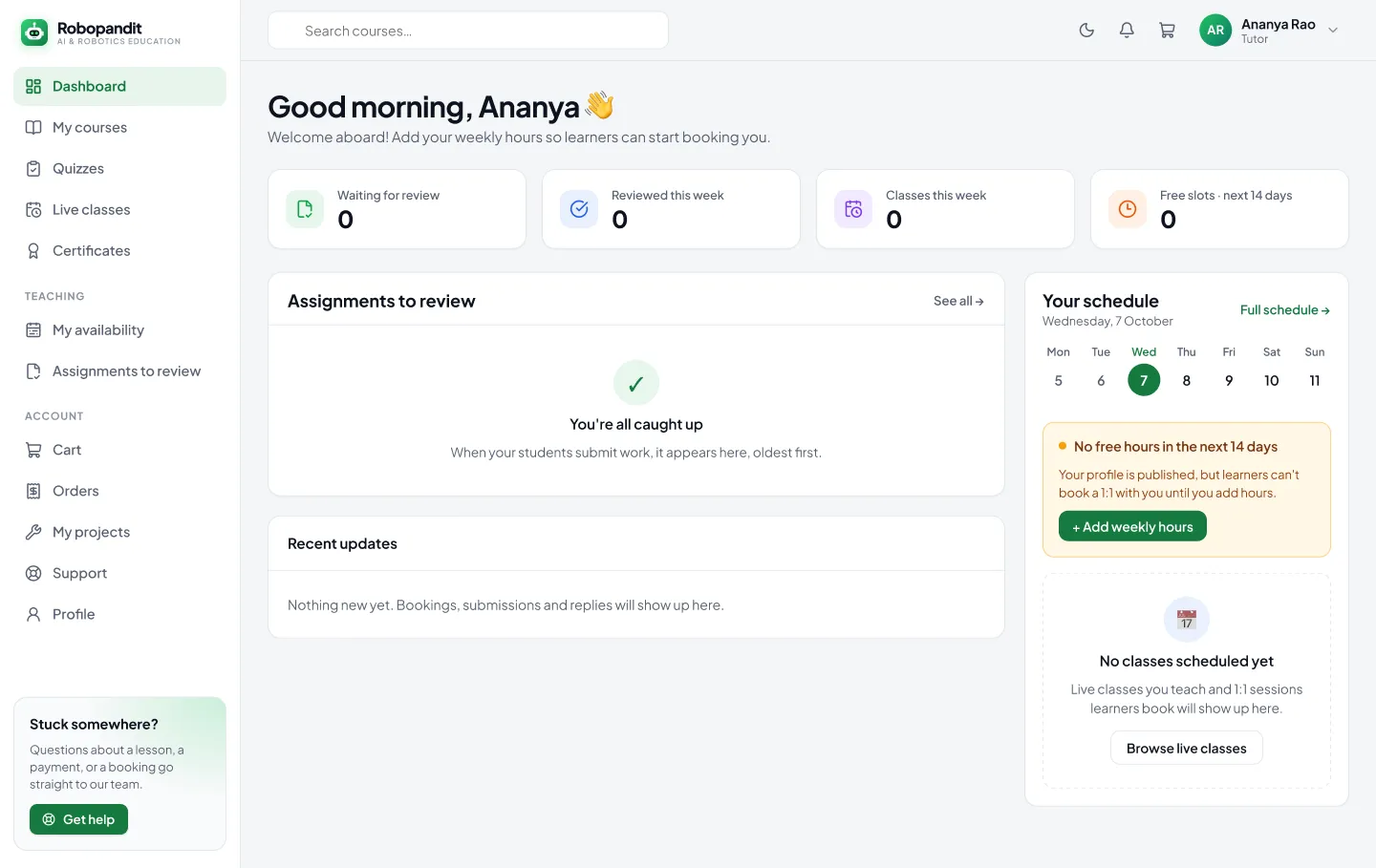
A new tutor has no classes and no reviews yet, so a home built for busy tutors would be empty. I designed a first-day state that still tells them what to do next: add weekly hours, then wait for the first booking.
Why it was cheap to build
The redesign uses RoboPandit's existing components and only data the platform already has. Some of it is a quick fix: sending admins straight to their console after they log in can ship this week. The full tutor home is a bigger piece, but it doesn't need new features behind it.
If your product has more than one kind of user, log in as each one and look at the first screen. Is it about their work, or someone else's?